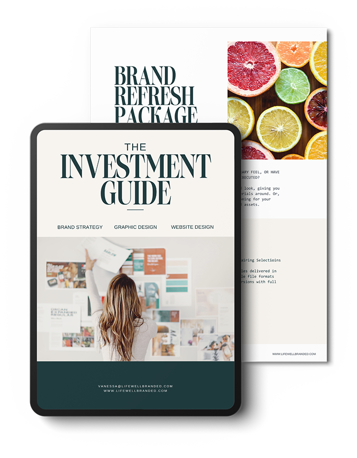
DALE LITZ
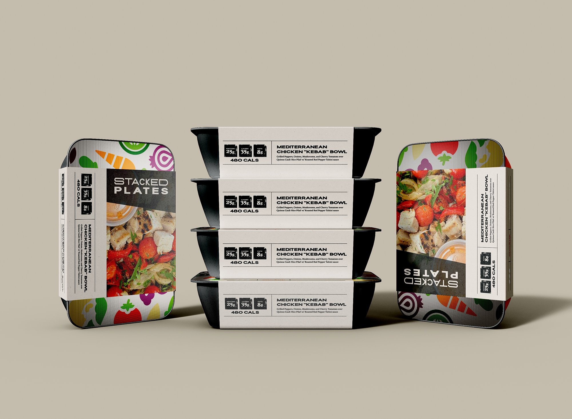
STACKED PLATES
At Stacked Plates, we believe in Food as the fuel for life, love, and connection.
Through globally inspired cuisines and locally sourced ingredients wherever possible, we aim to connect people to other cultures, while fostering community relationships. We strive to help you achieve your wellness goals by offering healthy and fresh, never-frozen prepared meals that save you time, that never sacrifice flavor or nutrition, and empower you to fill your plate with more of what matters.
Brand Voice & Tone
UPLIFTING.
ASSERTIVE, YET COMFORTING.
EMPATHETIC.
FRIENDLY.
Brand Traits
TRUSTWORTHY.
GENUINE.
CHARITABLE.
INNOVATIVE.
HUMBLE.
GOOD HUMORED.

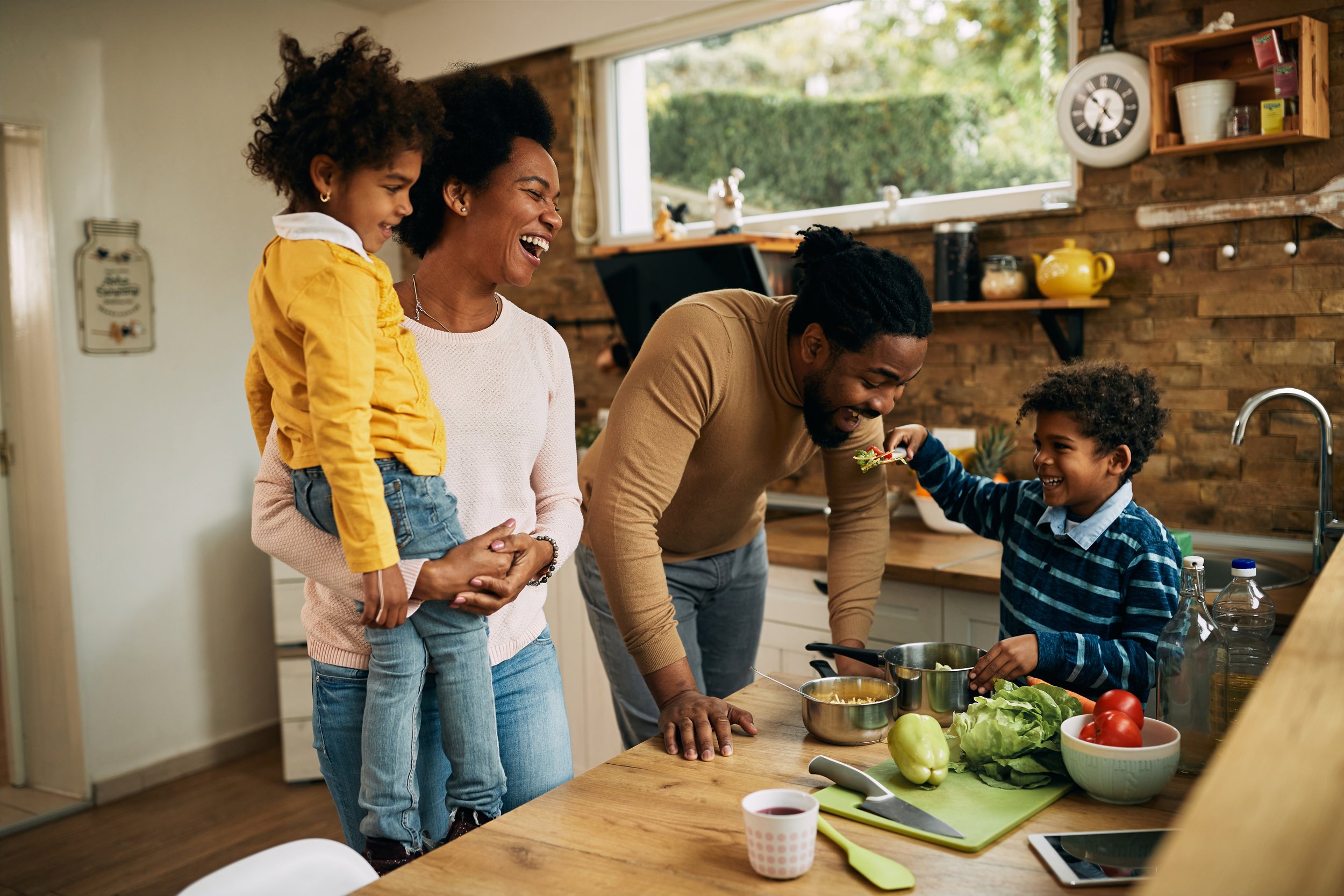
The STACKED PLATES Client
Mid 20s to early 50s, males and females
Health conscious individuals — either single, busy workers who devote a lot of time to their job/charity/community, or married couples with families that are super busy with kids activities; want to devote more time to their family and less to cooking, prepping, etc... without sacrificing nutrition.
Athletes, or others actively involved in health and wellness activities, (yoga, running, lifting, biking).
Strong values; feels a very strong affinity with community, charity, or some cause that is near and dear to their heart.
Believes that mind and body are inextricably connected, and fuelling one, fuels the other.
Surrounds himself/herself with positive, uplifting people


Logo Breakdown
The “stacked” elements and typography in the logo intentionally reinforce the concept of the “Stacked Plate” mission to “Fill your plate with more of what matters.”


The Stacked Plates logo incorporates a set of ‘stacked plates’ in place of the Es, the top plate filled with abstract elements that represent healthy food that fuels and sustains.
An expanded typeface was chosen (shorter in height, and wider in width) to mimic the proportions of dinner plates and weight plates, pairing well with the size and shape of the plate element.
Subtle texture is added to refer to the natural, organic texture often seen in food/soil, as well as the subtle metal texture of weight plates. This texture helps to break up the harder lines of the logo, giving an overall feel of imperfection and authenticity.
The rectangular shape with angled corners surrounding the letterforms is a nod to the idea that this food is conveniently prepared and packaged for you, and references the shape of the takeout containers.

“Vanessa was able to draw out more significant and valuable information from us for our brand like our personalities, prominent influences, and our principal morals and values to help us come up with the most effective ways to reach our target audience. From colors, to fonts and templates (and so much more!) Vanessa diligently researched our industry, wonderfully creating a visually inspirational mood for our brand that articulates exactly who we are. The easy to use tools that have been given to us will make sure that we are able to continue to speak volumes to our clients in multiple ways, today and into our future.”